|
In class we studied the different fonts or typefaces. There are three types of fonts and/or typefaces: serif, sans serif and decorative. Sans Serif has no serif flicks and is a constant stroke throughout the front and/or typeface. While serif has serif flicks, slanted serifs on lowercase letters, serifs on the feet of letters and thick/thin strokes within the font and/or typeface. A decorative font and/or typeface often convey a mood, should be used sparingly and is difficult to read in large doses. 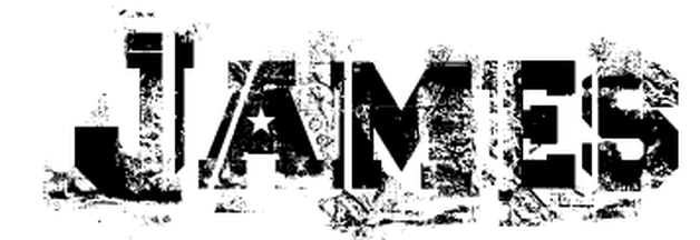 Font Name: Ascent 2 Stardom Ascent 2 Stardom Font reminded me of the abstract view in which I see life. The use of the fracturing the letters represents the fractured pieces that make up who I am. 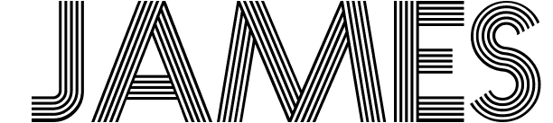 Font Name: Prisma Prisma Font reminded me of the early 1920 movie theaters. I love history and this font reminders me of how attractive the movie signs were during that time. 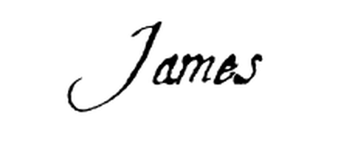 Font Name: Aquiline Two Aquiline Two Font reminded me of when my uncle would write my name with his quill pen. He was a large part of my childhood and someone I always looked up too.
0 Comments
|
Archives
April 2017
Categories |
 RSS Feed
