|
On all three of the images below are a mixture of Rule of Thirds and the Nine Zone Grid methods. The images below are from my lunch this week. The Rule of Thirds is a rule in which the image is cut into three equal parts while the Nine Zone Grid method cuts uses the Rule of Thirds both horizontally and vertically. In the Nine Zone Grid there are focal points in which the lines cross each other. I focused on these two methods because they are widely used and they have been the most prevalent in the images I have seen. 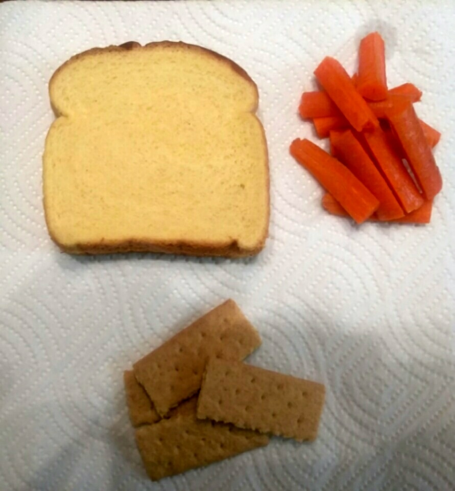 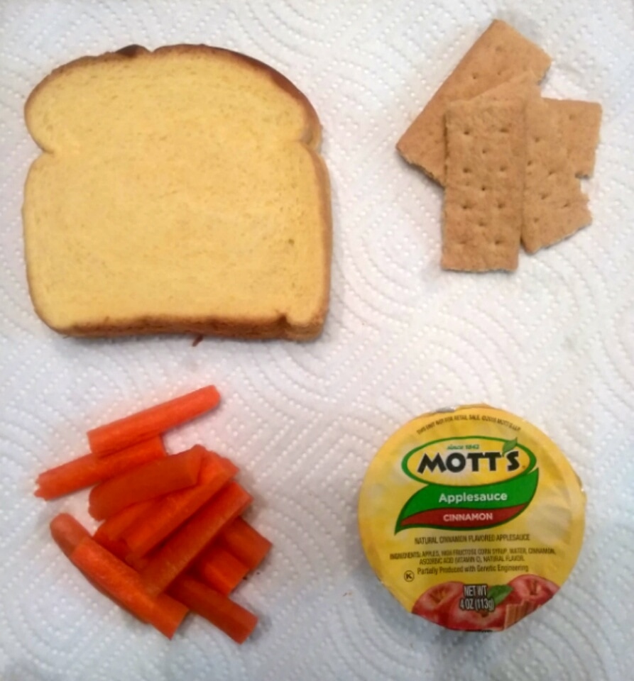 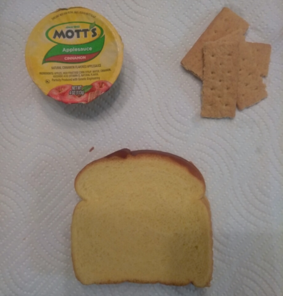
0 Comments
The 30 Day Photo Challenge Project is made for us to test our photo taking skills and apply what we learned in class into actual real world examples. Truly I enjoyed doing this assignment. I am not the kind of person to take photos but I enjoyed this project over all. I would have to say that my favorite days of the challenge would have to be days; 6, 7, 10, and day 19.
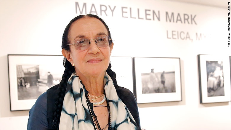
From review this exemplar artist's work the photo that appealed to me the most was "Rat" and Mike with a gun, Seattle, Washington 1983. It appealed to me the most because of the strong message it sends showing a young man with a gun in an ally. This photograph relates to children's lives in low income areas like the areas that I lived in when I was younger. Not only did this photograph remind me of my childhood it reminded me of how other kids had to fight through for what they needed in life even if that meant doing something illegal. Mark does a great job in capturing the contrast between the dark back ground and the highlighted gun in the center of the photograph. Artwork Resources
*Mary Ellen Mark Home Page * Mary Ellen Mark's legendary photographs * Mary Ellen Mark Compositional theory is a set of methods and rules that are used in many art pieces. There are rules such as nine zone grid and methods like cropping and line of sight. These rules and methods are techniques that are used in many art pieces. We are learning about this because we have been looking at and studying pieces of visual art. Rules1. Nine Zone Grid - Divides the page into nine equal zones, vertically and horizontally, placing the focal point on a point of intersecting lines. 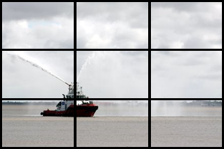 2. Rule of Thirds - Divides the page into three equal zones that can be either horizontal or vertical. 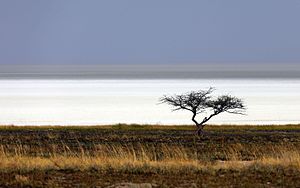 3. S-Curve - A flowing line that carries the viewers eye back and fourth manner through the composition. 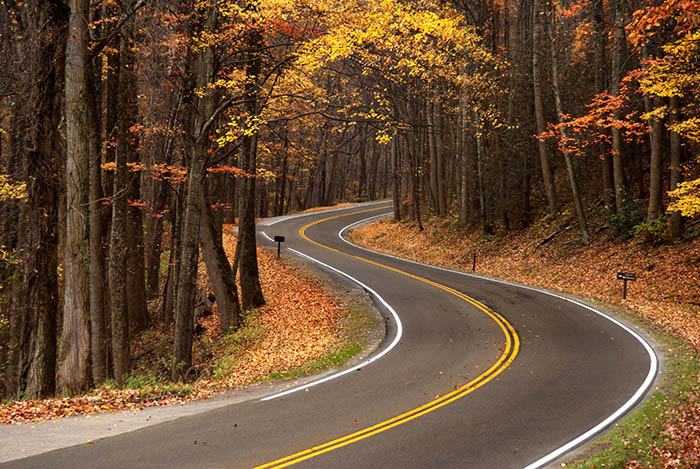 Methods1. Line of Sight - Implied lines suggested by the direction in which figures in a picture are looking, or from the observer's eye to the object being looked at.  2. Cropping - The removal of the outer parts of an image to improve framing accentuate subject matter or change aspect ratio. 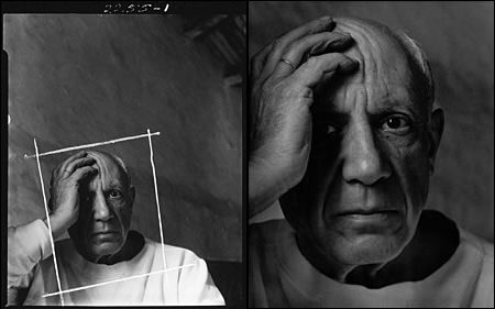 3. Overlapping - to extend over or past and cover part of. 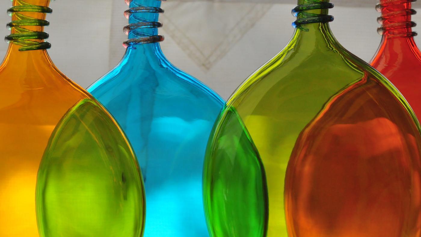 4. Negative Space - The space not occupied by an object or figure by circulating in and around it, contributing to the total effect of the composition.  5. Unity and Variety - Allows for differences in elements but visually connects the other pieces by having some elements that relate to each other. 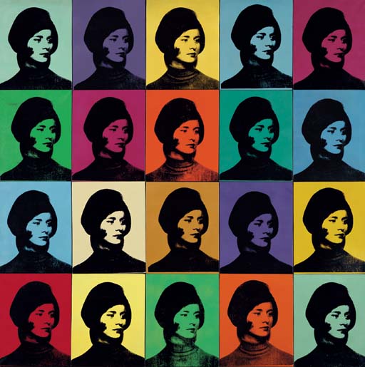 6. Framing - Provides a sense of depth, scale, and distance within a piece of art. 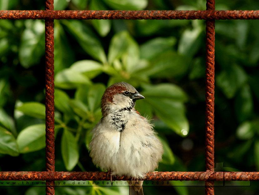 7. Triangle Method - Locate images on the three points of a triangle to create a stable, yet interesting image. 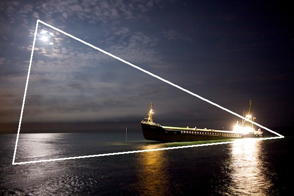 In class we studied the different fonts or typefaces. There are three types of fonts and/or typefaces: serif, sans serif and decorative. Sans Serif has no serif flicks and is a constant stroke throughout the front and/or typeface. While serif has serif flicks, slanted serifs on lowercase letters, serifs on the feet of letters and thick/thin strokes within the font and/or typeface. A decorative font and/or typeface often convey a mood, should be used sparingly and is difficult to read in large doses. 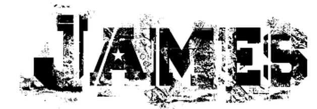 Font Name: Ascent 2 Stardom Ascent 2 Stardom Font reminded me of the abstract view in which I see life. The use of the fracturing the letters represents the fractured pieces that make up who I am. 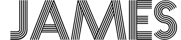 Font Name: Prisma Prisma Font reminded me of the early 1920 movie theaters. I love history and this font reminders me of how attractive the movie signs were during that time. 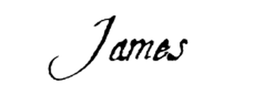 Font Name: Aquiline Two Aquiline Two Font reminded me of when my uncle would write my name with his quill pen. He was a large part of my childhood and someone I always looked up too.
|
Archives
April 2017
Categories |
 RSS Feed
